NG Digi+
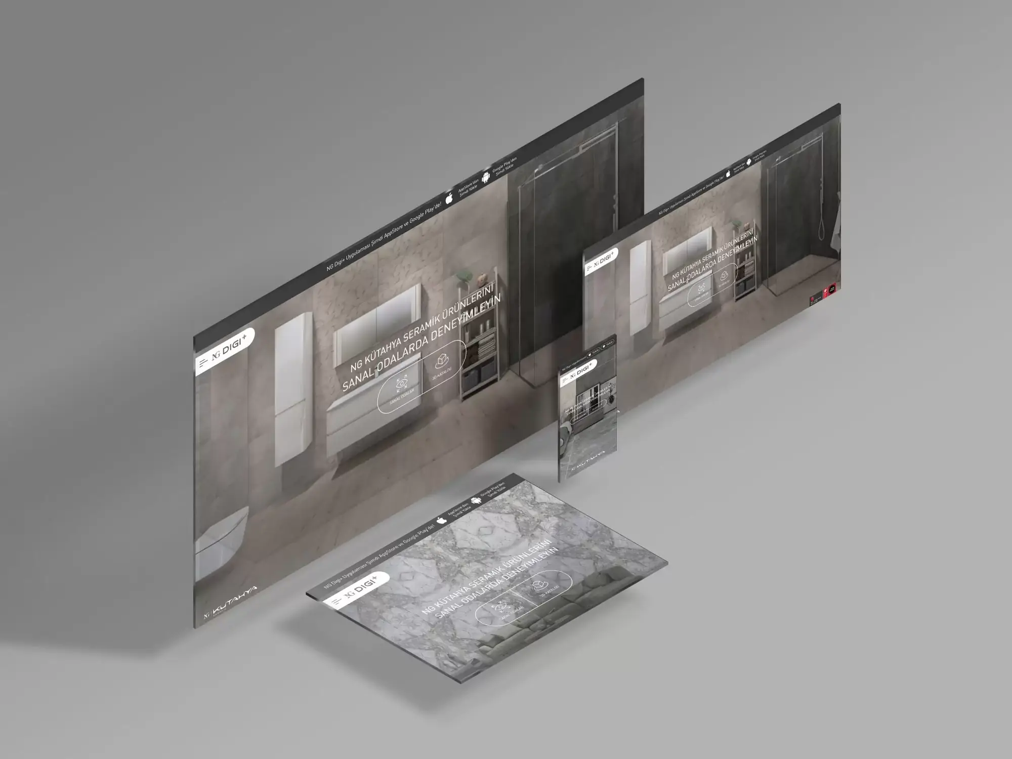
For NG Digi+, the digital platform where Kütahya Porselen presents NG Kütahya Seramik products through virtual rooms and a 3D catalogue, we took on an interface design centred on the user experience.
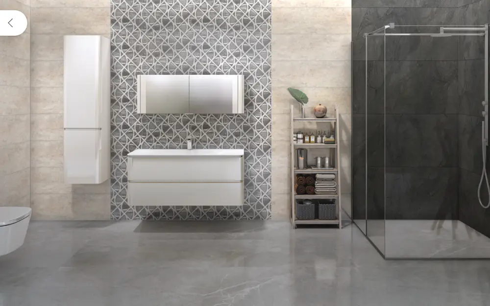
We crafted an experience where customers replace the floor and walls of ready-made virtual rooms, from bathrooms to living rooms, with any series they like and assess the product as if they were seeing it in a real space. For the 3D catalogue we designed a flow that narrows down series with filters such as size, colour, texture and surface, lets customers examine a product in 3D and applies it straight to a virtual room.
With a pared-back interface limited to dark grey, black and white, we made sure the only colour on screen comes from the ceramic products. The virtual rooms and 3D catalogue sections of the platform, which is used in Turkish and English, are also available in the iOS and Android app.
- Client
- Kütahya Porselen
- Year
- 2022
- Region
- Türkiye, Turkish and English
- Work
- Virtual room and 3D catalogue interface for ceramic products
- Service
- UI/UX and product design
How NG Digi+ works
-
Chooses a virtual room
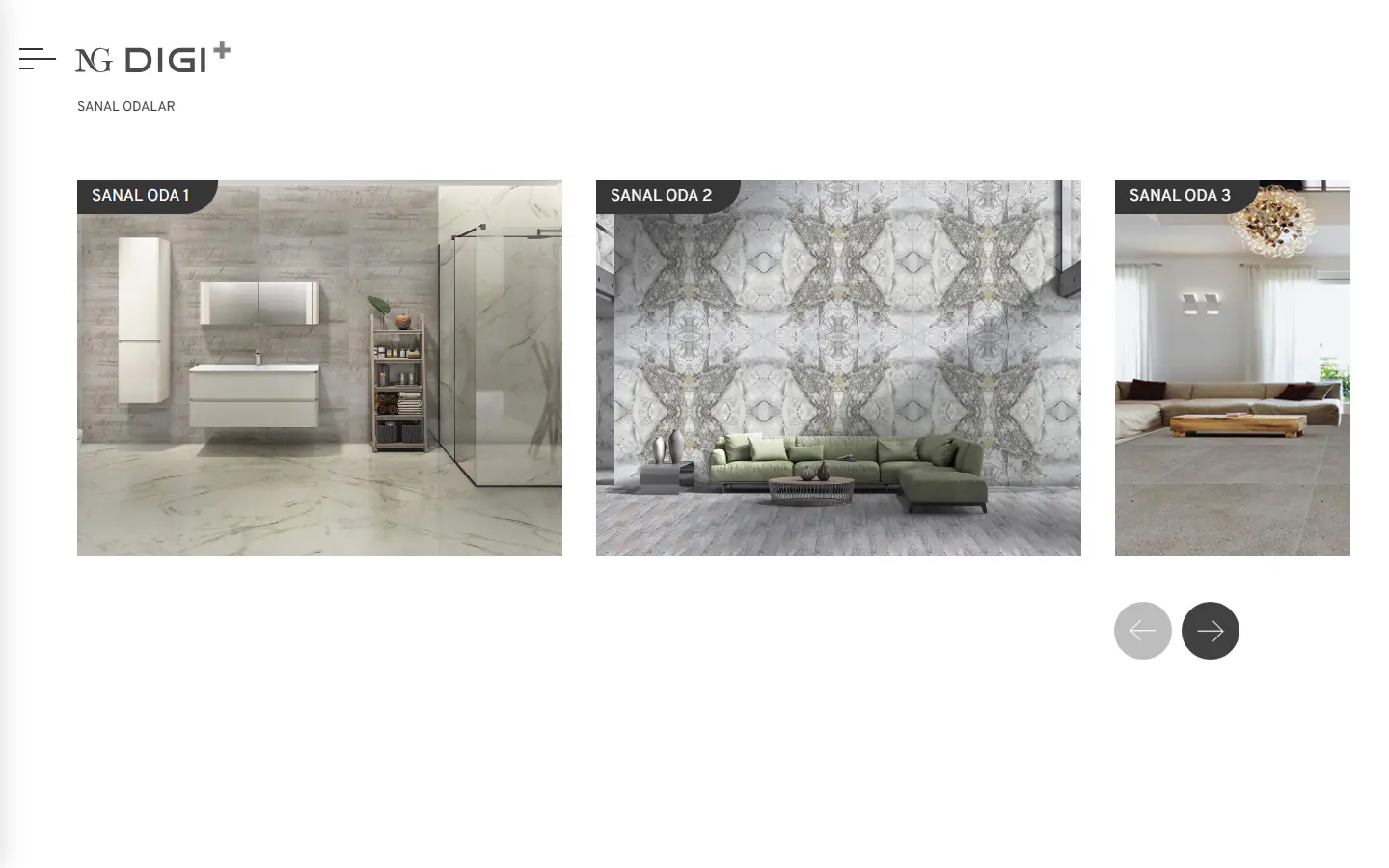
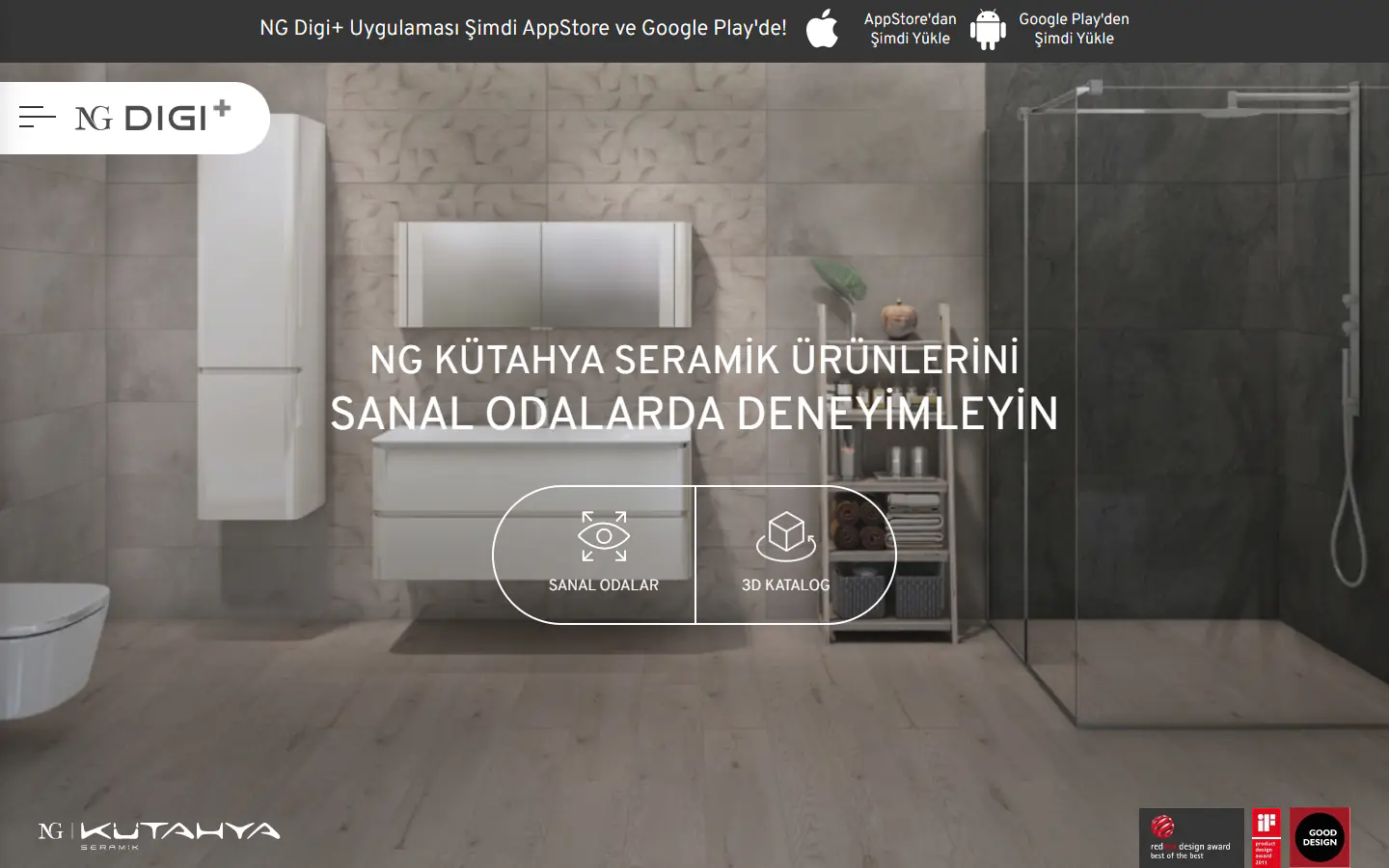
On the start screen, customers find two options: virtual rooms and the 3D catalogue. In the virtual rooms section we lined up ready-made spaces from bathrooms to living rooms, so the experience starts directly with the choice of a space.
-
Changes the floor and walls
Customers pick a surface from the markers in the room, and the series suited to that surface appear in a list. By applying the chosen product to the room, we let customers compare different series in the same space.
-
Explores products in the 3D catalogue
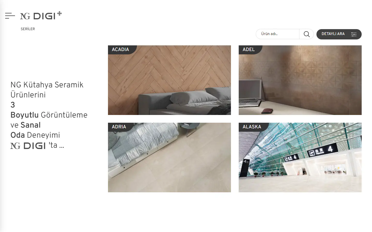
Customers narrow down series with filters such as size, colour, texture and surface. With a flow that lets them examine a product in 3D and apply it straight to a virtual room, we brought the catalogue and the virtual rooms together in a single experience.

Design language
By limiting the interface to dark grey, black and white and supporting it with thin, light grey lines, we made sure the only colour on screen comes from the ceramic products. This simple, balanced language turns the platform into a neutral showcase where the products stand out through their own colours and textures.

Overpass
Light 300 Regular 400 SemiBold 600
Sanal odalarda deneyimleyin
- #363636 Dark grey Announcement bar, labels and buttons
- #000000 Black Text
- #CCCCCC Light grey Inactive arrows and lines
- #FFFFFF White Background and menu
What we did
-
Virtual rooms
12 ready-made virtual rooms, from bathrooms to living rooms, that show products in a realistic setting.
-
Products for each surface
A list of series and products suited to the floor or wall surface chosen in the room.
-
3D catalogue
Products examined in 3D, with the chosen product applied straight to a virtual room.
-
Detailed search
Series search with filters for size, colour, texture, area of use, surface, shape, PEI and R.
-
Mobile app
The virtual rooms and 3D catalogue sections also available in the iOS and Android app.
-
Two languages
A bilingual interface design that can be used in Turkish and English.